A home page that shows how Tempi works
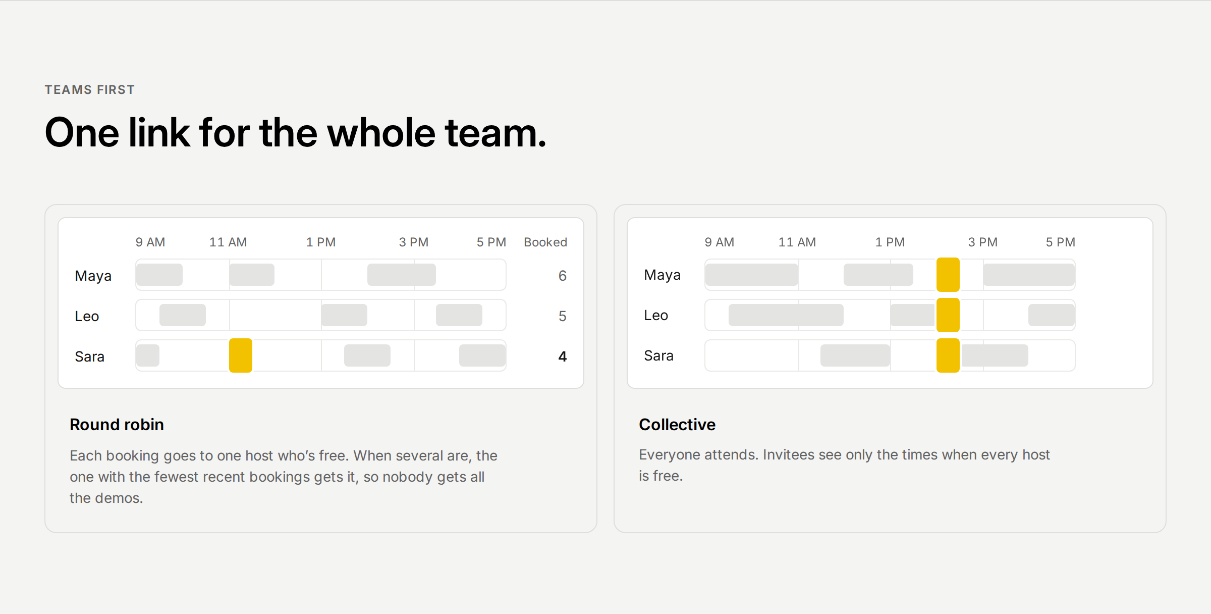
The home page used to describe Tempi in cards of text, next to a copy of the app with menus that did nothing. Now each part shows what happens. Try the booking card and the week at the top: pick a time, confirm it, and see it land. Only what you can use looks like a control.
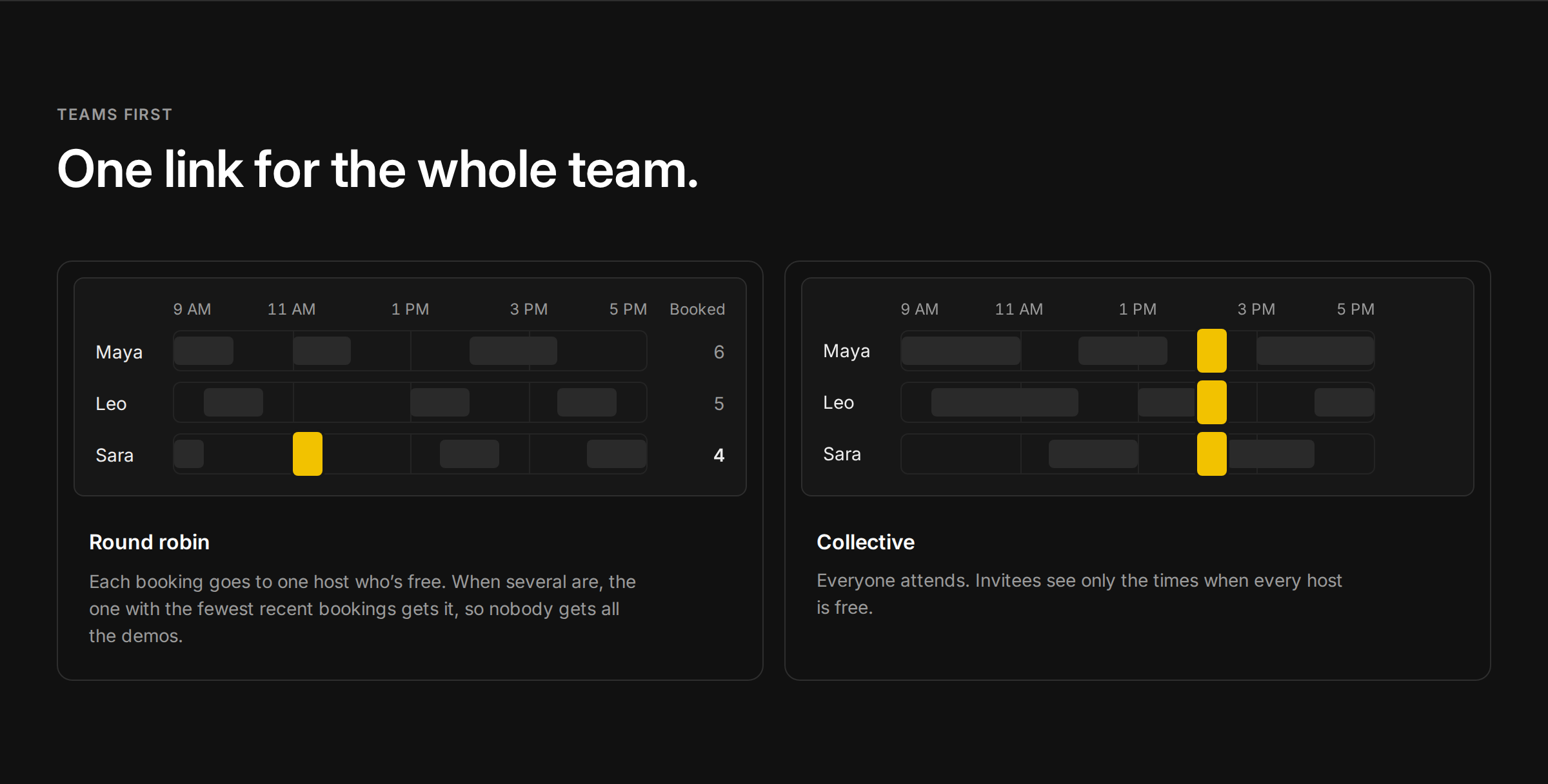
Below it, round robin hands out bookings to whoever is free and has the fewest bookings, and collective finds the one half hour every host is free. A terminal shows an AI assistant booking a demo from one sentence. The calendars section shows how busy time from Google and iCloud keeps bookings away, and how the invite looks when it comes from you.
Improvements
4
- Block invitees by typing an email address or a domain and choosing Block. The list shows who’s blocked, and you can remove anyone.
- Team pages show what the Team plan will cost once it opens. Everything stays free for now.
- Secondary text, badges and form fields are easier to read, in light and dark.
- Words across Tempi, its emails and its error messages say exactly what happens.
Fixes
3
- A sign-in code works for 15 minutes, even if you asked for a new one. Work email can take a few minutes to arrive.
- After Tempi updates, an open page no longer goes blank. It loads the new version.
- Pages no longer fail to load when Tempi is busy.